Repositioning eLearning Industry
Now, almost 8 years after it was founded, eLearning Industry has established a fresh brand experience that reflects the company’s growing global presence and unique position in the market.

Introducing eLI
We’re firm believers in the power of Learning and Development and in the power of sharing. While our beginnings were humble, we are now proud to say that more than 936,000 eLearning professionals visit our platform each month.
A “jaunty yet wise” brand
Even though eLI is a multi-touchpoint brand serving diverse audiences, we took a fresh look at what they all have in common and decided on the strategic approach of a “jaunty yet wise” brand that embodies one common principle: the continuous desire to learn, grow, and improve.

Powerful and playful really do look good together.
A new era. A new icon.
We purposefully moved away from the seemingly rigid and conservative “Tree of Knowledge” logo and translated the brand’s pillars: Community, Teamwork, Responsibility, Process, and Productivity into Melissa the Bee. A symbol that reveals wisdom, strength, and harmony, encouraging open communication and a unified community.

A friendly symbol and a bold wordmark create a memorable pairing.
The logotype is made up of two parts: The symbol and the wordmark.
A wordmark that is designed to maximize its impact across all applications while keeping it easy to read and highly recognizable.
A wordmark that is designed to maximize its impact across all applications while keeping it easy to read and highly recognizable.

A brand new typeface
The “father of geometry” Euclid and the “queen of symmetry” Melissa have something in common.
Our font family is designed to look great in any context. Its name is Euclid Circular B. The font is a key element in our brand. It works to maintain consistency, create clarity, and provide equity to the brand as a global leader in the eLearning industry.
Our font family is designed to look great in any context. Its name is Euclid Circular B. The font is a key element in our brand. It works to maintain consistency, create clarity, and provide equity to the brand as a global leader in the eLearning industry.

Our primary palette is made up of two colors: Hive Yellow & Bee Blue
A secondary palette is used as accent colors to help bring vibrancy to the visual system. Make sure to use the color values for our brand, as shown on the next pages, because when people see our color palette, we want them to think about eLI.
Hive Yellow
RGB 253.185.19 • HEX #fdb913
Bee Blue
RGB 0.0.200 • HEX #0000c8
Mustard
RGB 255.206.0 • HEX #ffce00
Huney
RGB 255.168.0 • HEX #ffa800
Orange
RGB 255.134.0 • HEX #ff8600
Rose
RGB 255.83.0 • HEX #ff5300
Turquoise
RGB 0.206.200 • HEX #00cec8
Azure
RGB 0.109.255 • HEX #006dff
Orchid
RGB 107.0.232 • HEX #6b00e8
Violet
RGB 0.0.200 • HEX #0000c8
Bold, friendly, and expressive
Our iconography is connected to our typography at a fundamental level to maximize recognition.
Icons and their usage principles were designed to communicate different kinds of messages quickly and effectively.
Each icon contains Hive Yellow & Bee Blue lines.
Icons and their usage principles were designed to communicate different kinds of messages quickly and effectively.
Each icon contains Hive Yellow & Bee Blue lines.
eLI puts people first.
Different characteristics and looks—uniqueness
The company's mission is to truly understand, educate, and connect with people. This is why we created a playful and imaginative feel by illustrating each and every one of our eLearners.

Inspiring through metaphor
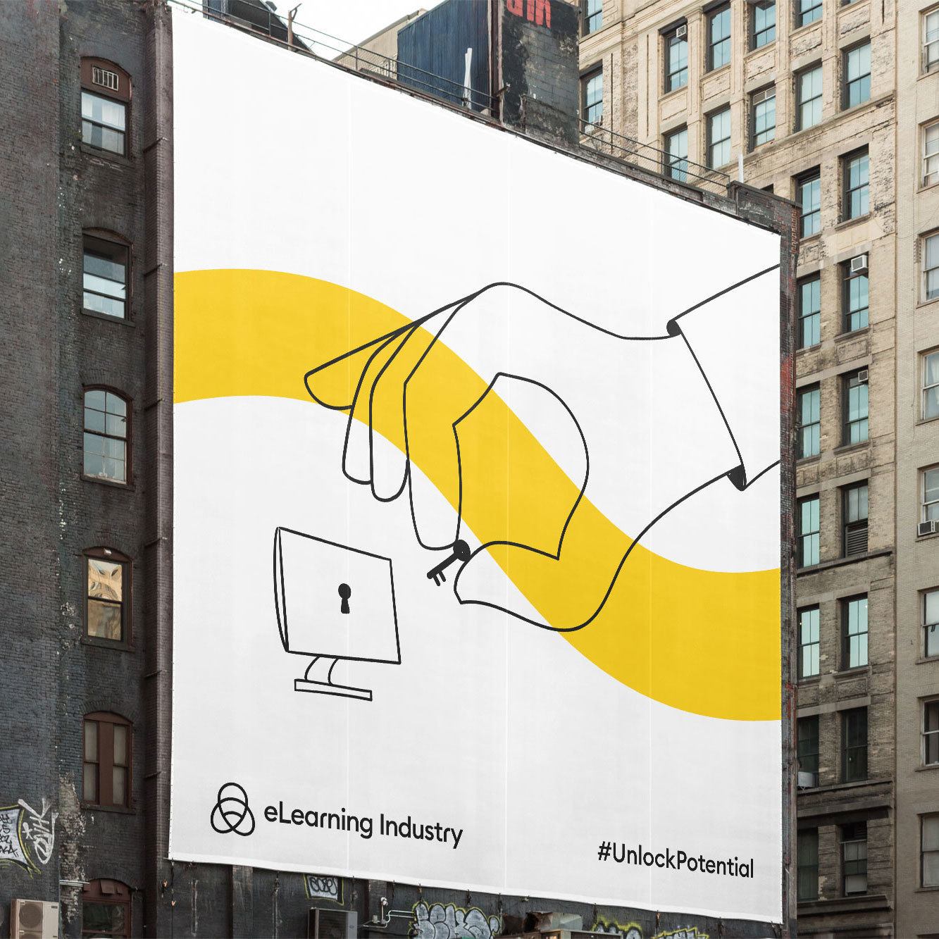
Allegoric and figurative real-life scenarios.
An illustration style that allows us to communicate with our audience about complex tools and marketing practices in a simpler and more personal way.
The illustrations are easy to understand at a glance, but there is always a slight twist, giving viewers the room to explore with their own imaginations.

Our graphics are based on a honey bee’s communication system.

Melissa never stays still. She learns through movement.
The round dance is used to signal food sources 25-100 meters away from the hive or closer. As the bee moves further away from the hive, the dance begins to change. The waggle dance includes information about the direction and distance required to fly to the goal.

The brand’s expressive character.
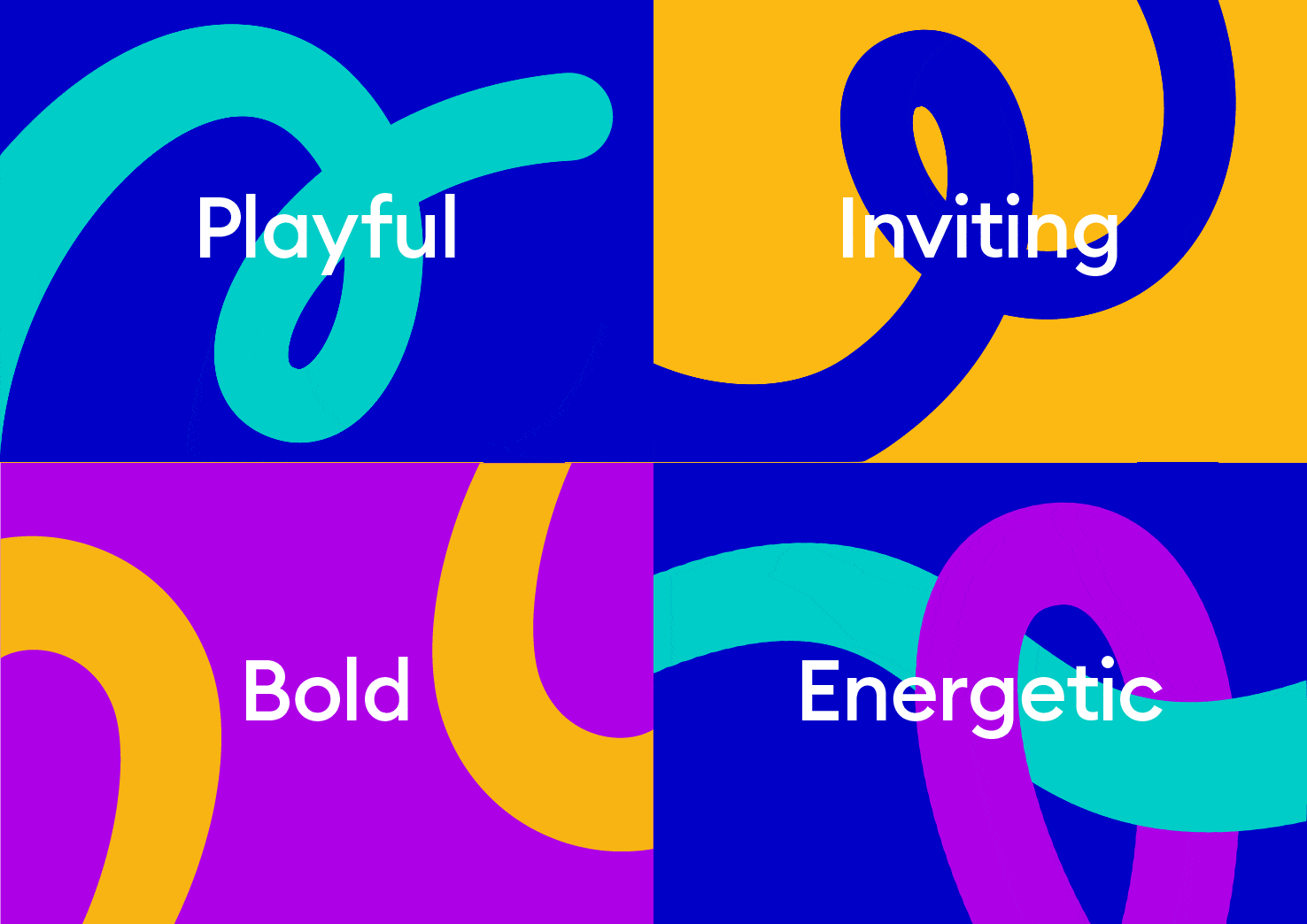
To visualize a happy, supportive community accessible from anywhere in the world, we built a colorful, diverse identity full of lively graphics.
A shape system derived from the geometry of a Honey Bee’s Communication Dance forms graphics that are playful, flexible, and fresh.
A shape system derived from the geometry of a Honey Bee’s Communication Dance forms graphics that are playful, flexible, and fresh.

Human interaction, expressive gestures.
Our photography inspires our audience of customers and partners, both locally and worldwide. Our people are accessible; their faces look friendly and natural.


With a distinct and extensive set of brand tools, eLI is repositioned as a powerful category leader aptly equipped to take on new challenges and connect with distinctly different audience segments in a meaningful way.
#ShareKnowledge!